Occasionally, I'll post whatever pictures I take, or frutiger-aero themes I create. I don't make sketches or drawings. Usually i just use a graphic designer for my creations.

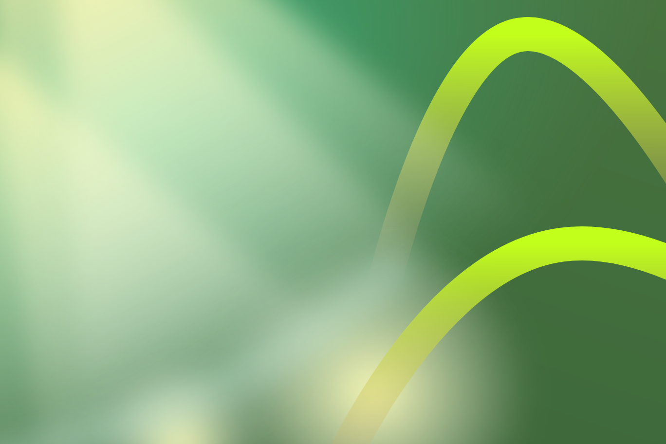
This was my attempt at making one of those aurora things from Windows Vista. I love the backgrounds they have,
but I don't really like how they never experiment with deeper blues or more yellows. Early in production, it's easy to
tell that I developed a different image for it, which eventually turned into this heavenly glow over this line in the "sky."
Despite it not being what I originally sought out to create, I'm still very happy with the results, and it serves as a
personal testament to my ability to create beautiful imagery from some free logo designer.

When I worked on Fry in the Sky, I found out about "light cones," where I could use a fade and blur on some triangles to add rays of light to a picture. This is the work where I actually started to experiment with it. To be honest, I think that the light is too opaque. You can see exactly where it ends and collides with other rays. It just doesn't feel natural. I love the loops, though. I think the loops inside the realistic lighting creates a beautiful little piece. I kind of wish that the second loop wasn't so steep, but it's whatever, because whatever critiques I had previously were resolved in the work below.

I love this piece of work. I loved it so much that, when I made it, I set it as the background on my desktop AND browser. It's just THAT good. It's got the perfect charm to it, the colors work together perfectly, the light actually looks like light that shines down on the loops on a perfect pose. Just beautiful. I actually used this background for the Song Highlights page and its songs on there too. Just my favorite piece so far.